A platform to enhance the experience of my work.
09
Website Breakdown
Web Design
image
This was a personal project of mine to use a platform to test my coding skills and put myself in a position where I can push my coding knowledge and experiment with different ideas. The website is completely hand coded by myself from scratch using pure html, css, javascript and jquery.
  • Client
  • Personal
  • Deliverables
  • Art Direction
  • Coding
  • Typograpghy
  • Ui/Ux Design
  • Fluid Design
  • Web Design
Grid System
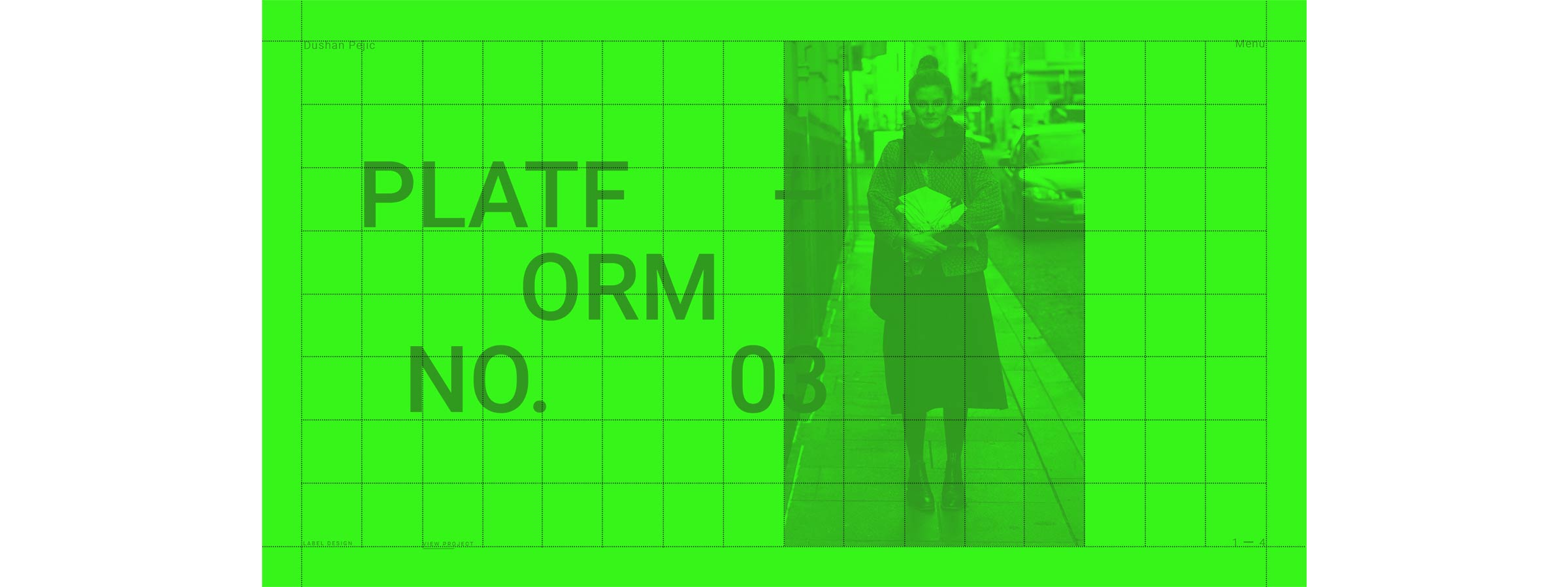
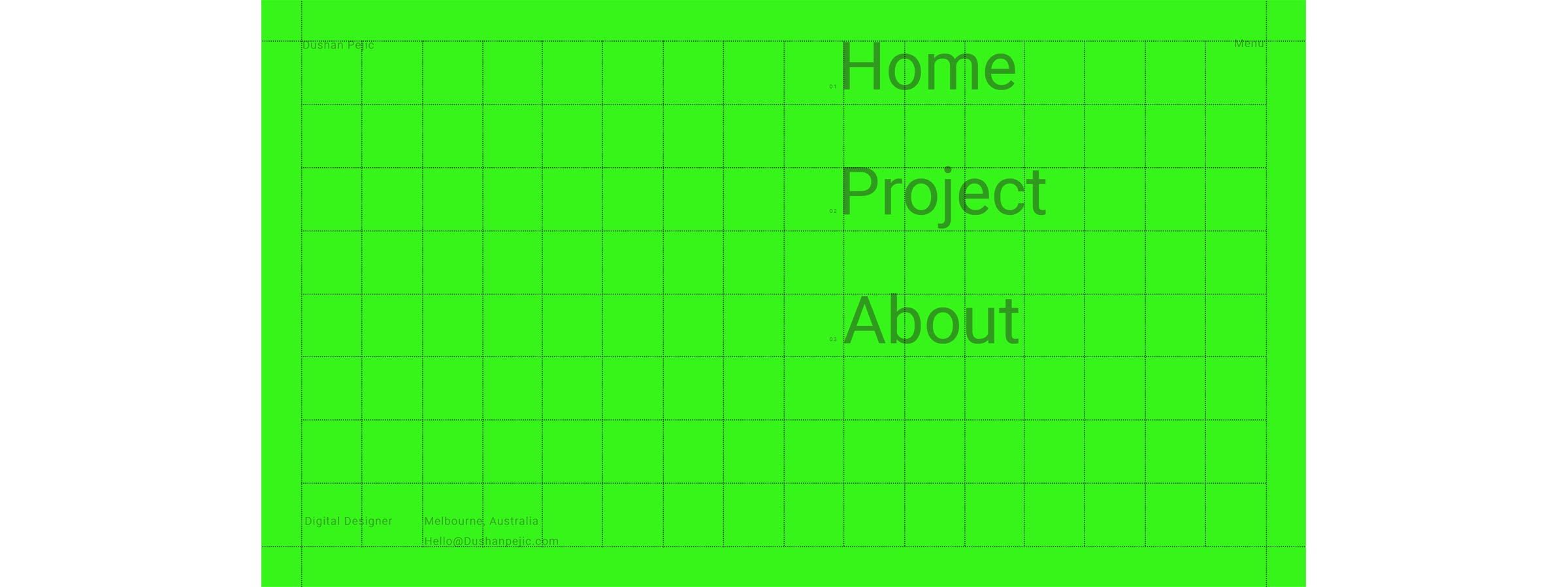
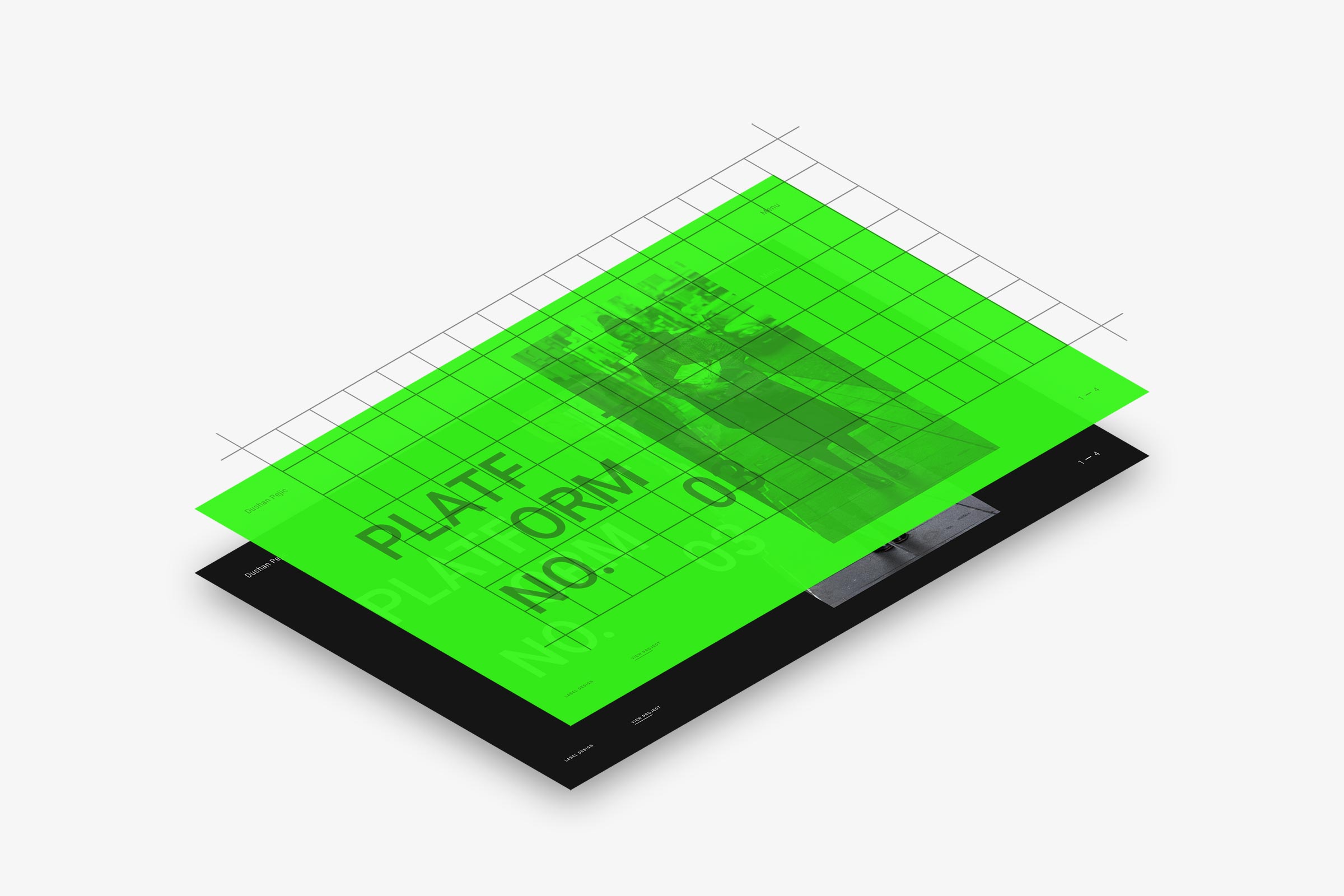
Wanting to influence a typographic approach to my overall website aesthetic, a grid format was the most practical solution. There are two grids. One is a fixed grid that is 16 x 8 and the other is an auto grid. The auto grid is based on the cell size of the fixed grid to ensure any added content would be in proportion throughout the website.
Fluid Design
The core of the website and most of the typography uses “Fluid” fundamentals as a way to ensure the website is in proportion no matter what the screen size is. It should not be confused with a responsive layout as the website doesn't snap but instead elements position themselves depending on the screen size. “Be as water my friend” - Bruce Lee.
Smart Padding
The padding is a stand alone element from the rest of the site. All of the padding throughout the website uses the same sizing. No matter what the screen size is the padding will look in proportion. This is done by a series of calculations that allows the padding to scale from a maximum size point to a minimum point.
Mobile Friendly
The basic functionality of a desktop screen is eradicated on the mobile and a new coding scheme is implemented using “Responsive” coding principles. The aesthetic of the website is greatly altered for a simple and easy to use interface.
image